It might sound odd to call interior decorating exciting, especially if you're not a professional within that industry. But that's exactly what it is when combined with augmented reality.
I recently found out just how fun it can be when I downloaded the new Sotheby's Curate app for the Magic Leap One.
- Don't Miss: 5 Magic Leap Apps You're Probably Missing, Including Star Wars, the Magicverse Matrix, AR Jenga, & More
Sotheby's app follows in the footsteps of the mobile versions of the Curate app for iOS and Android. The apps let anyone get a rough idea of how furniture might look in their own home before making a purchase.
Adario Strange/Next Reality
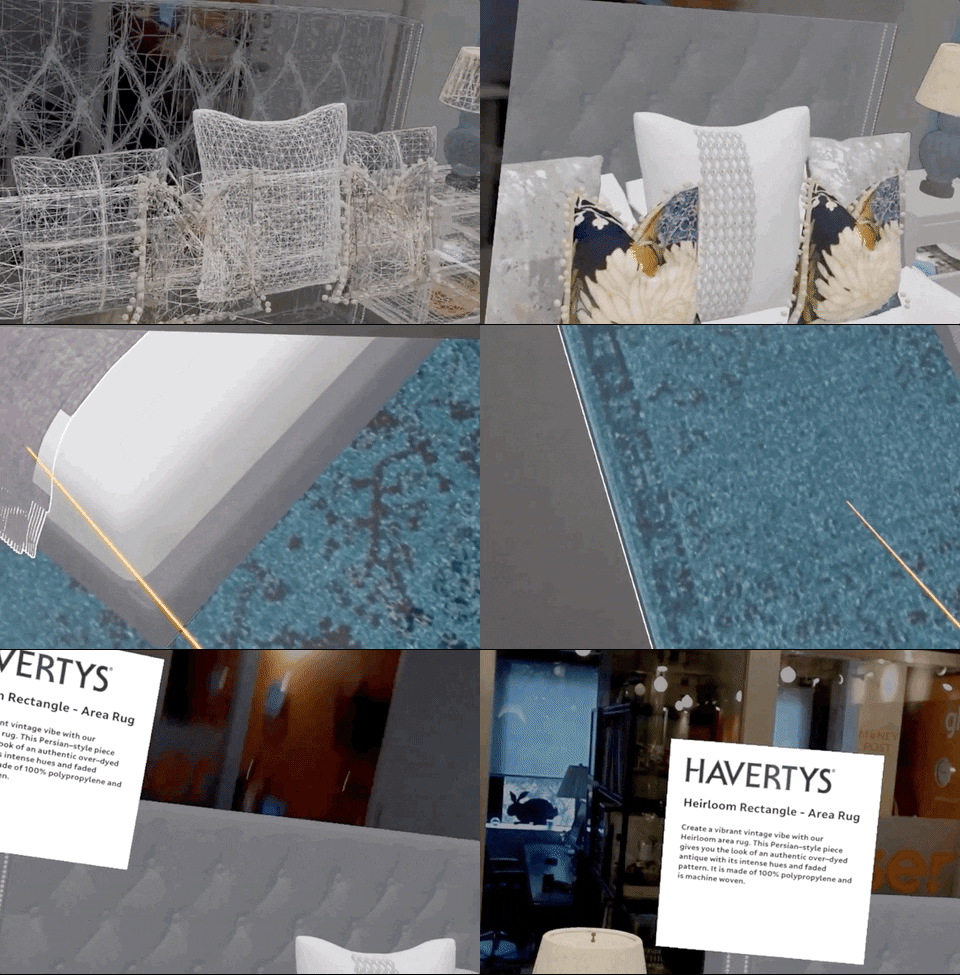
The big difference with the Magic Leap app comes down to immersion. Although the mobile apps can offer a relatively decent idea of what may or may not work in your home via AR, the Curate app on Magic Leap One allows you to wander around and examine life-sized furniture outside of the boundaries of a tiny handheld screen.
Adario Strange/Next Reality
The effect feels a lot like walking through an actual showroom, as the items require no scaling and sit realistically beside any furniture that exists in your real-world space.
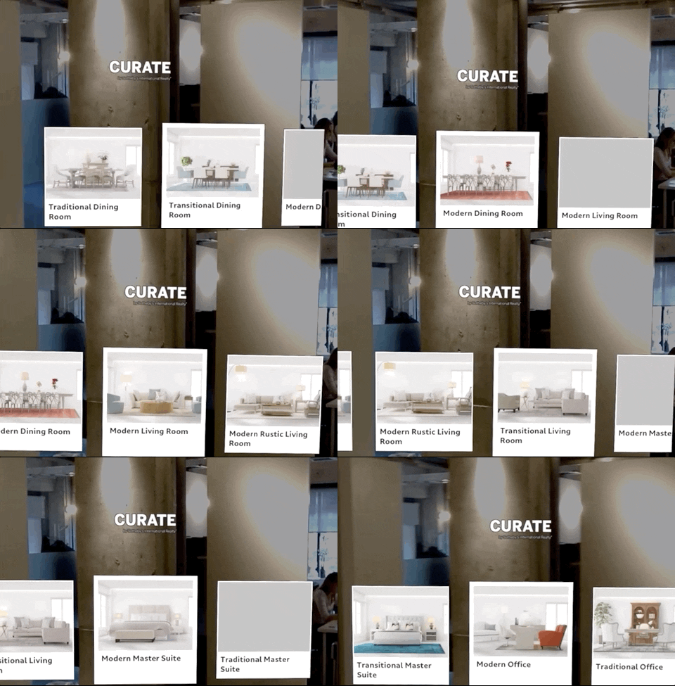
Developed by roOomy, a Silicon Valley-based company that uses AR and VR to help support real estate and interior design professionals, the Curate app is so dead simple to use that its only limitation is that you run out of fun set-ups to try fairly quickly. Currently, the app only gives you nine set-ups to choose from, including bedrooms, living rooms, dining rooms, and office environments.
Adario Strange/Next Reality
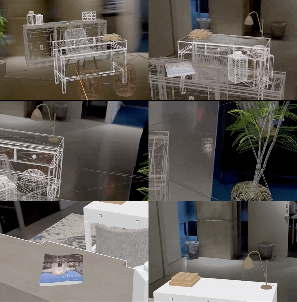
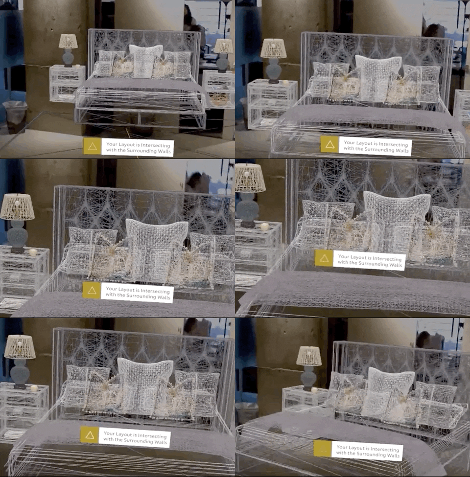
Another major advantage of using the Magic Leap version of the Curate app comes through its sheer realism. Because you're required to scan your real-world environment, the app will alert you when you're trying to place furniture in a space that's already occupied by real objects.
This might sound trivial, but that tiny detail helps maximize the sense of immersion by putting your virtual object on par, in a sense, with your real-world objects, allowing you to interact with the AR furniture more naturally in terms of placement and viewing angles.
Adario Strange/Next Reality
The most engaging aspect of the app is the fact that it doesn't skimp on detail. Literally everything you see — from plants to tiny knick-knacks, to the rug beneath your feet — are clickable items that offer in-depth detail on the item.
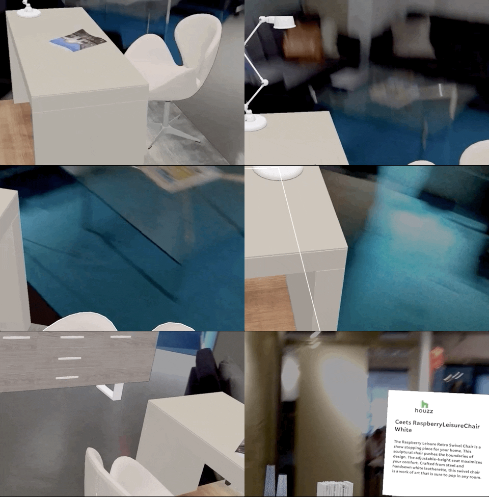
Adario Strange/Next Reality
Unfortunately, the app doesn't offer click-to-buy functionality (at least not when I tried it), so you're mostly limited to browsing.
I was able to find things shown in the app, like the Pottery Barn Mini Faux Potted Orchid and the Havertys Heirloom Rug, on the respective sites of the various brands, but the app would be a lot more powerful if I could simply click and purchase what I like via the Magic Leap One.
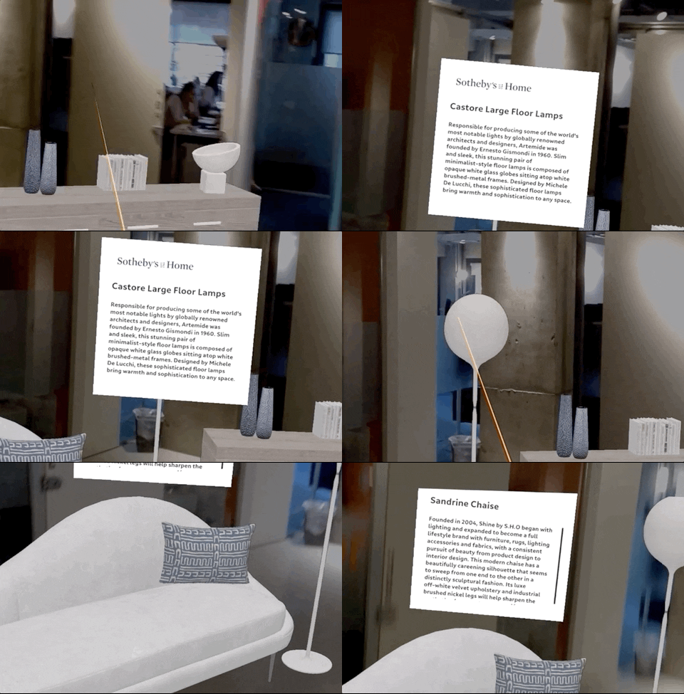
Adario Strange/Next Reality
The app is yet another idea that was initially supported by the Magic Leap Independent Creator Program earlier this year.
"Visual obstacles are still a constant struggle for consumers — especially when searching for a new home. It's a tremendous feat for homebuyers and renters to see beyond the imperfections of a vacant or unsightly space, making it difficult for real estate professionals to close deals," said Pieter Aarts, roOomy's co-founder and CEO, back in March when the Magic Leap support was announced.
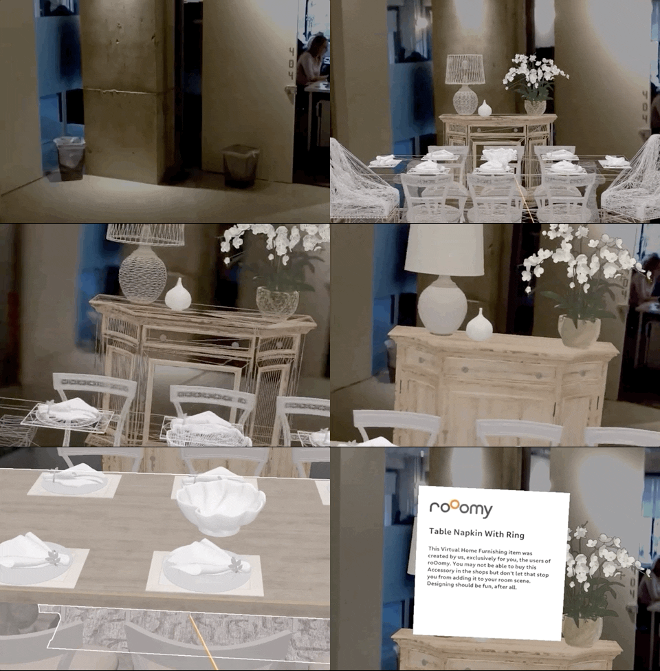
Adario Strange/Next Reality
"Because of our CGI and 3D modeling services for home furnishings retailers, and together with Magic Leap, we will harness the power of the Magic Leap One to deliver a state-of-the-art spatial computing tool that will continue to transform the retail and real estate industries," Aarts said.
Of course, the most widely accessible version of Curate for smartphones is likely how most will engage with Sotheby's virtual selections, but for next-level interior designers and real estate pros, the Magic Leap One version of the app is too powerful to ignore when it comes to visualizing new spaces via immersive computing.
Cover image by Adario Strange/Next Reality


Comments
Be the first, drop a comment!