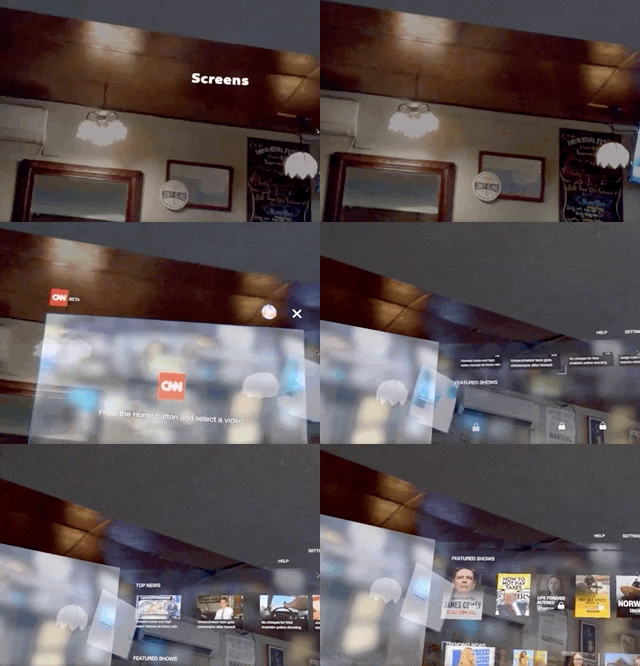
Magic Leap has done a great job of aggressively releasing new apps, software updates, and major franchise tie-ins. But aside from all the creative and entertainment apps, what's it like to use one of the apps the company hopes you'll use every day?
One of those apps is the CNN news app, and it recently got a refresh that's worth delving into.
I spent a lot of time living with the first version of the CNN beta app in the last couple of months. So you might wonder, "If you spent so much time with it, why are you just now writing about it in-depth?"
Well, frankly, I primarily held off because the experience was pretty terrible. Add to that the fact that the app went through a few updates, which compelled me to repeatedly dive back into the app and work out what had been fixed and what was still broken. The process was surprisingly time-consuming, mostly because the interface was pretty buggy.

The new version of the CNN Magic Leap One app
I'm happy to report that not only is that no longer the case, but the app has been completely updated with a new look, a new interface, and no bugs that I can detect. Therefore, it's finally time to talk about what it's like to immerse yourself in one of the biggest news channels on the planet in augmented reality.
Interface
First, it's important to point out that to get to the CNN Magic Leap app you first need to open the Screens app (which also hosts the NBA app and others).
The first version of the CNN Magic Leap app was attractive at first glance. It featured rows of video content that you could scroll down through, very similar to the interface you see on the desktop version of YouTube. In the new version, CNN has completely revised the look to offer a simpler workspace that's less visually translucent and contains fewer menu options.

The old beta version of the CNN app for Magic Leap One
At first, I wasn't happy about this, but the more I've used the app, the more I understand the logic applied to the new version. The developers of the new version of the app want you to quickly boot up the CNN app and start consuming news, not endlessly scroll through a ton of menus.
This newly economic interface makes even more sense you consider how you get to the app: Turn on the Magic Leap One > check off the spatial mapping prompt > click on the Screen app icon menu > then scroll to and click on the CNN app icon to launch. By the time you've actually arrived at the app, the last thing you want is more menus to scroll through.
Features
The app is broken down into three sections: Live TV channels (CNN, CNN International, and HLN — which all require a login); a free to watch (no login required) menu of videos of current world news, trending news, and top news; and News Programs and Original Series (both of which require a login). A fourth feature, which is new to the refreshed app, is the Spatial Explainers section, which is included in the same interface tier as the aforementioned login-only News Programs and Original Series area but is completely free.
Before you get into the content, let's talk about the login requirement. Although the app is entirely usable without the login-only content, if you're a subscriber to one of the cable providers that offer CNN as a part of your package, it may be worth it to you to go through the login process. It's relatively simple: When you click on any of the login-only videos, you'll be given an access code and prompted to visit a CNN Magic Leap activation page (cnn.com/activate/magicleap), after which you can select your cable provider. (When I watch CNN, I do it through my Sling TV account, but I couldn't find that option available.)
CNN requiring a login for the special programs is no surprise since the company wants to secure dedicated users. But to require logins on a cutting-edge device like the Magic Leap One seems a little short-sighted. A better option would have been to allow complete access to all the content for a set period (let users get addicted to the immersive app first) and then require login after 30 days or so.

As for the non-login content, it's great. The new version of the app is rock solid. Videos are as vibrant as you can expect in augmented reality, and the audio is crystal clear. I'm particularly a fan of the ability to place several video screens in your space, all playing at the same time. When I tried this with the first version of the app, the app would breakdown after I placed six to eight separate screens. In this version, you're limited to four simultaneous screens.
And a subtly effective touch here is that you'll only hear the audio of the screen you're looking at. So if you have four video screens playing, you can turn your head in the direction of a different video screen to hear different audio. It's a simple but powerful demonstration of spatial audio and why augmented reality has more to offer than traditional content vectors. For the hearing impaired, all videos have a large close captioned button that you can click to read the words spoken on screen.
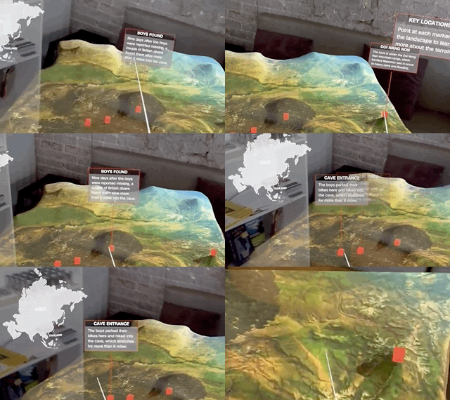
Aside from the robust video features in the app, the Spatial Explainers section is the somewhat hidden rock star of its feature set. In this section, the app presents you with another CNN news video story in augmented reality, but here, you're also given fully interactive 3D objects to explore associated with it. In the example shown below, the story is about the now famous Tham Luang cave rescue in Thailand.

Adario Strange/Next Reality
There are three videos available (each about a minute and a half), and when you click on each video, you'll see a 3D icon rotating next to the video. When you click on that icon, the object expands into a full-sized (about four feet by four square feet) 3D object that you can explore as the video plays.

Adario Strange/Next Reality
When you expand the landscape of the Thailand area, you can walk around the land area where rescuers found the children and click on key points on the 3D map to find out where certain events played out. And when you click on another video, which has a model of the cave featured in the story, you can use the controller as a flashlight to examine the interior.

Adario Strange/Next Reality
The entire interaction is the ideal version of how to consume news in AR. In some ways, I'd compare it to the stunning examples of broadcast AR we've seen on the Weather Channel. But in this case, the rain, animations, and 3D models are all things you can directly interact with rather than just passively watch.
Performance
By far, the biggest issue I had with the first version of the app was performance. It seems to push the Magic Leap One to its limits, requires only the most robust internet connection, and moving within the app was at times laggy to the point of frustration (even when not connected to the internet). The new version is smooth as ice and very fast.
Another thing I noticed is that the ability to place screens in your space has changed a bit, as it now allows you to move your arm (while holding the controller, no hand tracking in this app, yet) forward or back to either pull the screen forward and make it bigger, or send it further away and make it smaller. Previously, moving the screens around was fairly non-intuitive and erratic in terms of performance.
Conclusion
Although I'm not a fan of the login requirements, overall, the app is now one of the best I've used on the Magic Leap One.
And if you're wondering if it's possible to watch the news on several different screens throughout the day while working, yes, it's possible, I've done it. Of course, after several hours, your battery will wind down, and you'll need to plug in. But, as we all now know, sitting for too long in one place is not healthy, so you can take that recharge time as an opportunity to take a break.
There's still a bit of skepticism from some about the Magic Leap One's prospects as a mainstream user device that most people would use to consume CNN videos throughout the day, but if you're ready to live with one foot in the future, the CNN Magic Leap app should definitely be part of your augmented reality arsenal.
Cover image via Magic Leap


Comments
Be the first, drop a comment!